Content marketing can be very intense these days. Each day, the average consumer sees so many messages that encourage them to buy something, to order something, or to take a specific action, it’s no wonder that people start hesitating more before making any decision. When an audience is overwhelmed by the number of marketing content they see daily, they don’t rush to become the clients business owners want them to be—the ones who regularly buy something. That’s why CTAs were created.
WHAT IS A CTA?
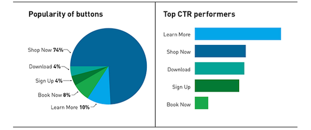
The CTA (call-to-action) is a clear encouragement to the audience to take action. One of the best and most common examples is the “click here” button we often see shrewdly placed on so many sites. Some CTAs are more effective than others, as seen in the picture below.

Source: sproutsocial.com
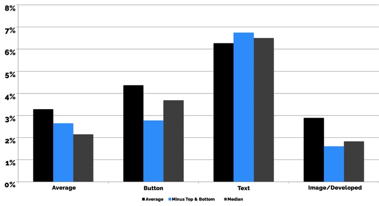
CTAs, however, don’t always come in the form of buttons. A line of text can be a CTA too, and could even be more effective. 2017 stats provided by Leighton Interactive show that buttons have 4.37% average click-through; images or developed (more complex) designs have 2.89% average click-through, while texts have 6.27%.

Source: leightoninteractive.com
IS A CTA EFFECTIVE?
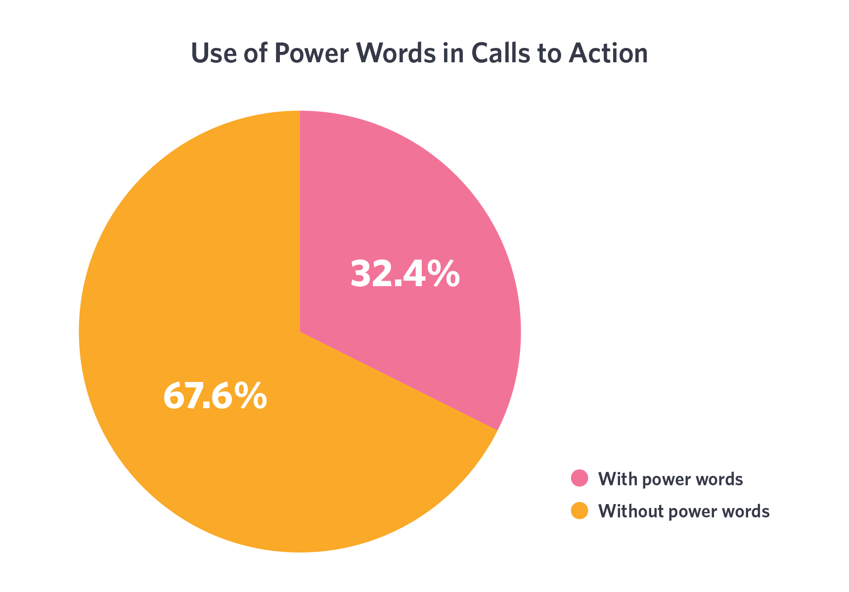
Yes, it is—assuming it’s good. As the examples above show, some CTAs are more popular than others. It often comes down to something as seemingly insignificant as word choice. One of the most common pieces of advice is to use so-called “power words” in CTAs to increase effectiveness.

Source: ctfassets.net
At the same time, not all businesses use CTAs. According to TruConversion, 70% of websites lack CTAs—and still manage to function well.

Source: truconversion.com
So in this article, we’ll dig deeper, and do our best to explain how exactly using CTAs could benefit your online business.

WHY ARE CTAS EFFECTIVE?
There are plenty of reasons; and some of the psychological ones are well summed up by Neil Patel. According to him, the audience expects to be told what to do next (even if they can figure it out on their own). Furthermore, people are curious by nature, and good CTAs manage to tickle that sense of curiosity, encouraging them to go and find out what comes next. But it’s not only these things that make CTAs so appealing. Good CTAs also:
1: HELP THE AUDIENCE AVOID CONFUSION
If you want your audience to do something, tell them what to do by emphasizing it with the help of design or text. This might not work for all of your potential clients, but it will eliminate the confusion for every one of them. If your website visitor finds your offer appealing, they will know what exact steps they need to take to get what they want—be it a product, a service, a free book, or the content of a specific article.
2: DIRECT YOUR READERS WHERE YOU WANT THEM TO GO
Not all CTAs should direct to products or services only. It’s only natural that you might want to build your authority in the potential client’s eyes before making them an offer they cannot resist. Therefore, don’t forget to include CTAs in your content pieces. It’s an excellent way to encourage the reader to read more or to explore similar articles, or to show them what the intention of your content is. It also allows you to flex your niche expertise, organically getting a leg-up on the competition. Plus, building some intrigue and excitement is always good—people are curious by nature, remember?
3: HELP GROW YOUR AUDIENCE AND BOOST SALES
Sometimes, CTAs can focus on building an audience; like the ones that encourage people to subscribe to newsletters, or to hit the like or follow button on Facebook, Twitter, and the like. These don’t bring you profit immediately but are still essential for naturally growing your audience. And sometimes, CTAs are used to guide your clients through the purchasing process. These are the ones like “buy now” or “submit payment”. You might consider them unnecessary; however, they do increase the chances of people making that purchase after all.
4: MAKE YOUR WEBSITE LOOK MORE ORGANISED
Good CTAs aren’t scattered randomly all over the website. There’s usually only a few of them, and they are placed strategically. Such CTAs help the site look more structured and more organised overall. They draw the visitor’s attention to the essential details of the website: subscription buttons, important products, services, discounts, sections, and so on. Therefore, using CTAs allows your visitors to locate important things quickly, which also boosts sales in the long-run. Now that we’ve discussed the importance of CTAs in content marketing, let’s take a more in-depth look at their placement.

THE PLACEMENT OF CTAS
CTA placement is based on three simple rules:
1: DON’T LIMIT YOURSELF TO ONE CTA ONLY
Some companies believe that there should be only one CTA on a page, otherwise it would lose its effectiveness. However, it’s the contrary; you need to have more of them to maximise the chances of visitors reacting to them. Sure, this doesn’t mean that you should use as many CTAs as you possibly can. Always ensure that they don’t compete with each other on a page, and don’t confuse your visitors with too many options.
2: PLACE CTAS ON EVERY PAGE OF THE WEBSITE
Keep in mind, every page gives the visitor a chance to do something. By creating appropriate CTAs for all pages of your website, you’re creating more opportunities for conversion. So why skip an excellent opportunity?
3: MAKE SURE THE CTAS STAND OUT
It takes more than just the right choice of words to make a CTA effective. You need to ensure that it stands out, and that your visitors will spot it no matter what. This can be achieved in two ways: design, and placement of a CTA. If you’re using a button or an image, make sure it looks good with the overall design of your website, and stands out at the same time. If you’re using a text CTA, make it stand out by being in the appropriate place and using convincing language. Email subscription forms that you often find on most websites are one of the best examples of proper placement. Crafting good CTAs is a skill that doesn’t come naturally for everyone. However, with a lot of practice and testing, everyone can learn how to create effective CTAs that aid their SEO strategy. Check out our Yuqo blog for more SEO tips!


